On April 16, you’ll notice changes to Infor, the enterprise resource planning platform that connects employees to myriad services such as payroll, PTO, learning modules and more.
Infor is performing an operating system upgrade that will change the user experience; it will be similar to when your mobile phone’s operating system goes through an upgrade.
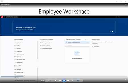
“Infor will still have all the same information employees depend on, but it will look a little different,” said Craig Breverman, Digital Technology Solutions manager of Infor. YNHHS managers and employees will have unique workspaces based on their roles. Instead of grouping links into designated boxes of content marked with various icons, Infor will display lists with links in folders with key headings, such as “My Information” on the employee workspace.
Other headings on the employee workspace will include Employee Information and Quick Links. Under My Information, you’ll find folders and links for pay, benefits, time (Kronos swipes) and learning (LMS). The new look features:
- Clean, clutter-free workspaces for managers and employees
- Streamlined, collapsible folders
- The ability to pin frequently used applications to your Infor Workspace
- Common tasks listed up front
The upgrade also keeps managers in mind. When logging in to Infor, managers will land on one page for all their needs – no more toggling between the manager and employee tabs.
Visit the Learning Management System (LMS) on Infor for a training video.

The “old” Infor landing page grouped employee information in dense lists.

The “new” Infor streamlines employee information with organized content and simplified visuals.


